Mapping data

Maps are critical to many areas of study, from epidemiology to climate science
Main attributes of a map
- Scale
- Projection
- Symbols used to depict information
Scale
Scale is measure of the proportion between distances and sizes on the map and those on the area represented

- Often, you'll see 1:200 or 1:50000.
- That means one unit of measurement on the map is equivalent to 200 of those units in the real world, etc.
Scale is measure of the proportion between distances and sizes on the map and those on the area represented

- So a large-scale map with higher detail would be 1:10000
- A small-scale map with less detail would be 1:100000000
- The scale you choose depends on your audience and the level of detail you want to express.
Projection
Projection is the process of making a globe, or portion of it, fit onto a flat plane.
- Transforming will always involve some form of distortion.
- Some distances, shapes, areas will be stretched and others will be compressed.
- There's no 100 percent accurate representation of a globe other than a globe itself.

But playing around with projections can lead to very interesting visuals
Projection centered on the South Pole
Data on maps

Data on maps
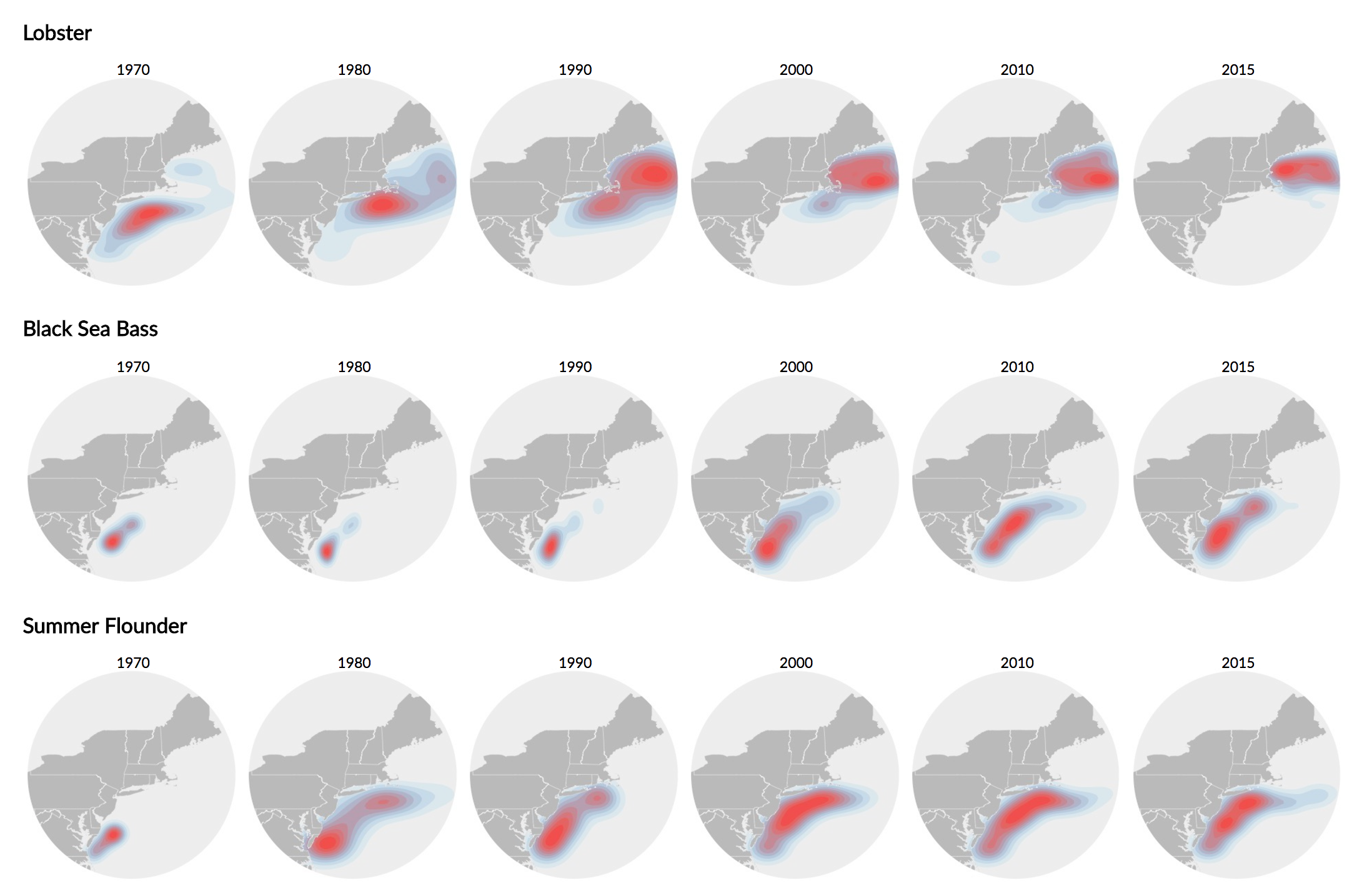
Thematic maps are meant not simply to show locations, but rather to show attributes or statistics about places, spatial patterns of those attributes and relationships between places. - Axis maps
Qualitative versus Quantitative

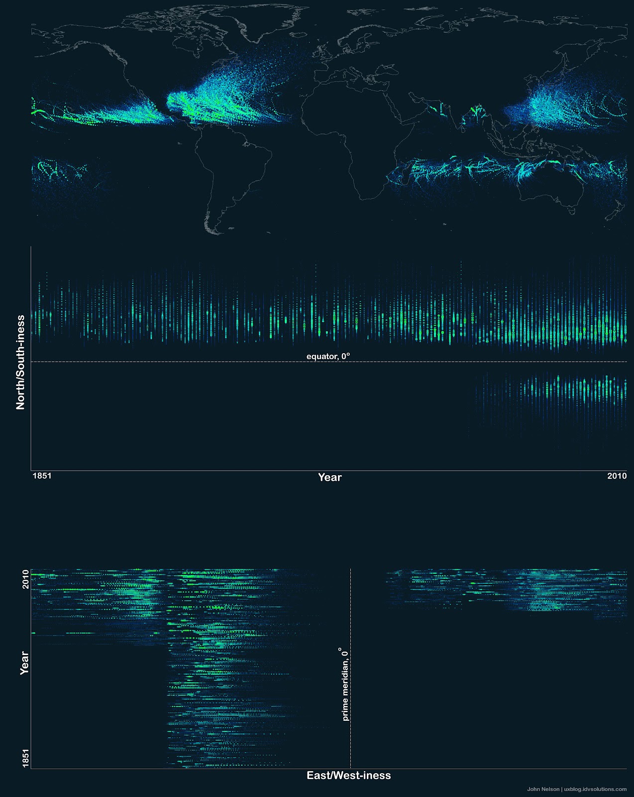
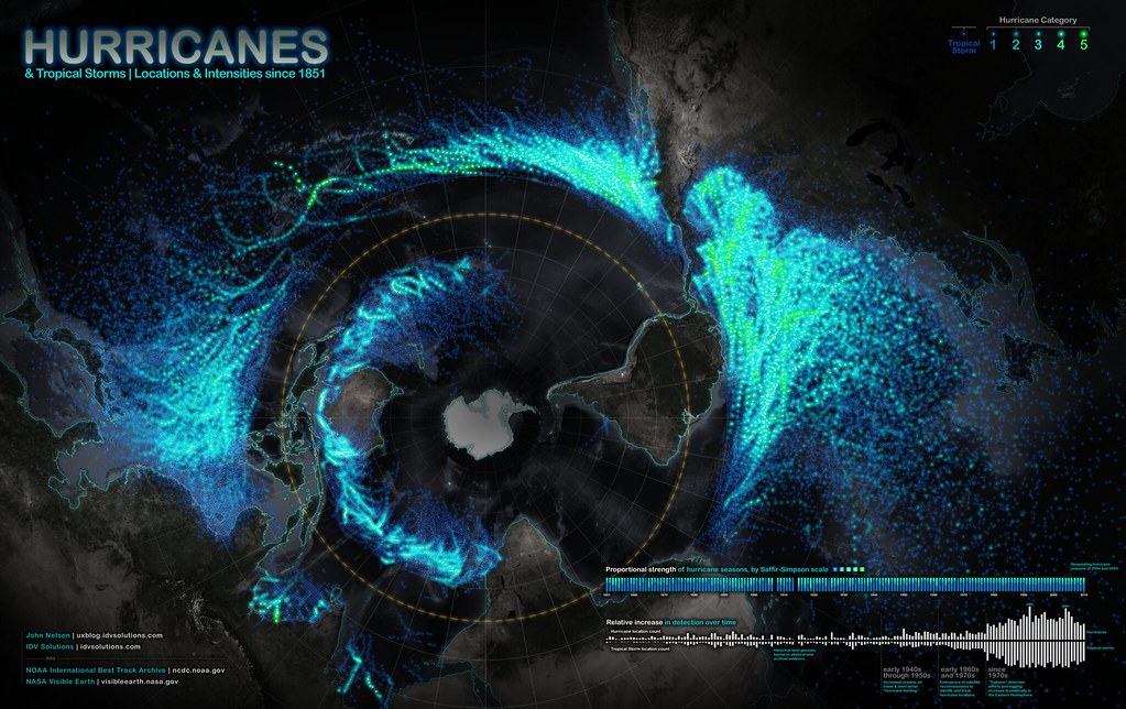
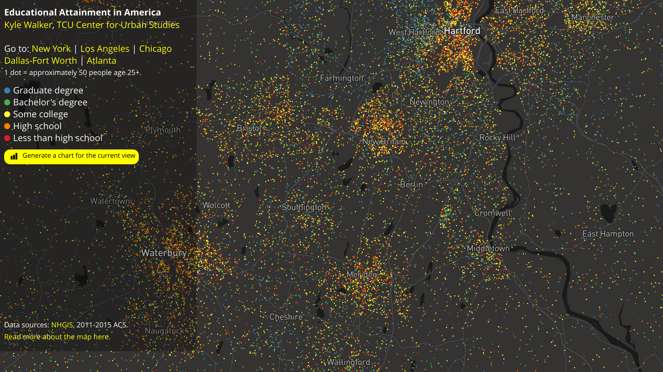
Point data maps
The simplest method is by using dots to represent either individuals or groups of a fixed size
Proportional symbol map
Geometric objects (usually circles) are scaled in proportion to quantities.

Proportional symbol map
Some problems with perception.

Proportional symbol map
A note about legends
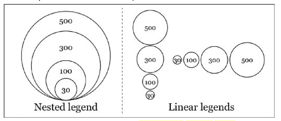
- Nested and Linear methods
- Don't use more than four
Multivariate
A note about legends
Line maps
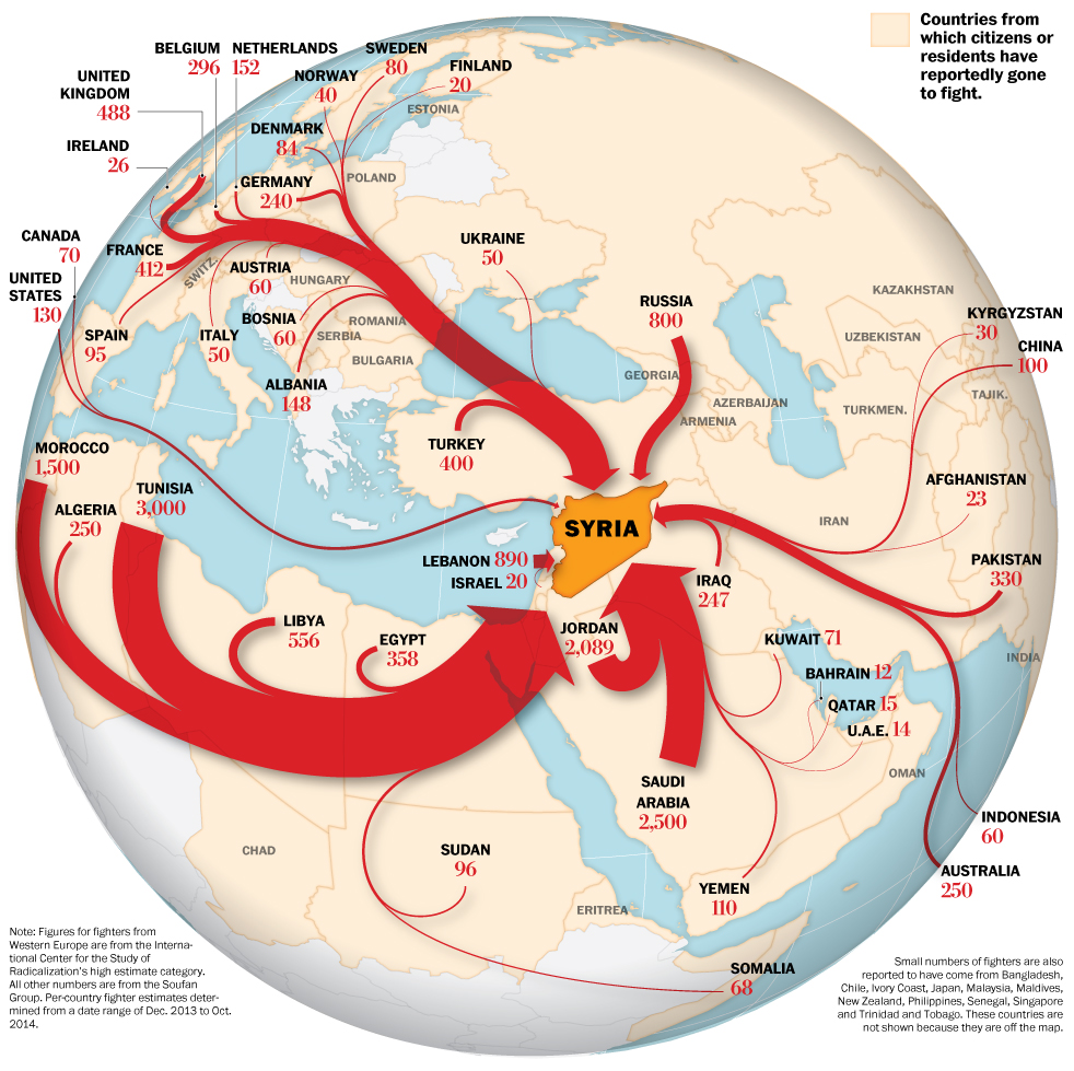
A flow map shows movement of entities between geographic areas.
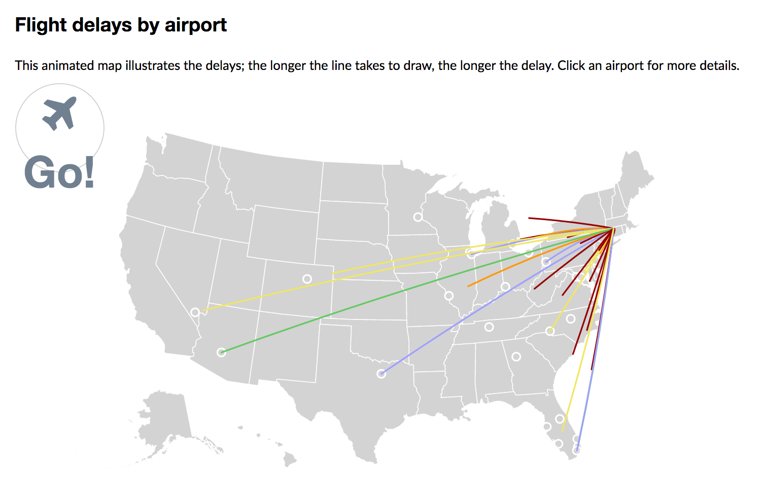
Line maps
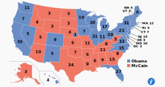
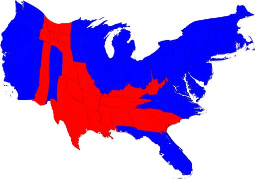
Choropleth maps
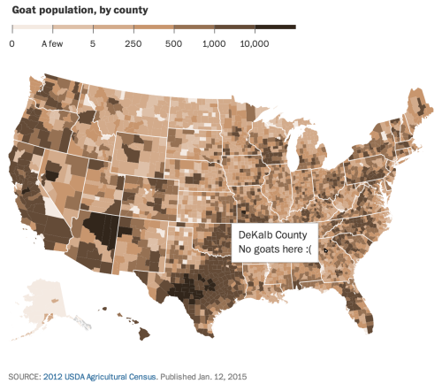
Choropleth maps
Choropleth map encodes information by means of assigning shades of color to defined areas such as countries, states, counties, etc.
A choropleth map can show different kinds of data, whether ordinal, interval, or ratio, etc.
Choropleth maps
Choropleth maps can be used for quick data exploration

Choropleth maps
Some notes
- Don't just settle for default settings when creating choropleth maps
- Grouping values can shift the interpretation of a map
- Examples: Intervals versus quantiles versus logarithmic scale versus mean and the standard deviation
Other types of maps
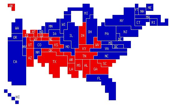
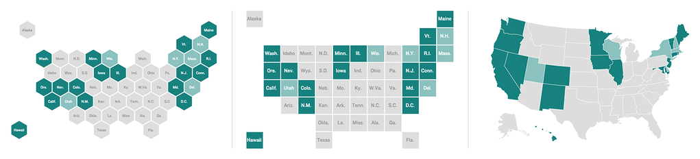
Cartogram is a map in which areas are scaled up or down based on some magnitude.
Other types of maps
Other types of maps
Other types of maps
Other types of maps
Abstract strategy of creating states that are the same size after transforming them into similar shapes.
Other types of maps
Isarithmic maps or contour maps