Telling good stories with visualizations
(Press S to see the notes that went with this presentation.)
The main goal of a visualization
A tool for your eyes and brain to perceive what lies beyond their natural reach
My process
- Started with the aggregate (overall)
- Added some visual heirarchy
- Determined and elevated the important takeaway
- Added styles for publication
- Added documentation
- How cool is that we can read graphics at all and notice the trends with our naked eye?
- How cool is it that the data I used was just there on the internet for free?
- And how cool that the tools I used were free and easy to use?
- This is why visualization is mainstream
- It's more democratic now
Data
There's way more data now and it's growing at an exponential rate
Beginning of time -> 2003
5 exabytes of data
According to Eric Schmidt
1 gig
1 terabyte is 1,000 gigs
1 exabyte is 1,000,000,000 gigs
Today
2 exabytes a day
The biggest challenge we've got these days is to help people avoid information anxiety
Unstructured information ->
Data ->
Structured information ->
Knowledge ->
Wisdom
Unstructured information

- Unstructured information is everything out there
- The rawness of reality
Data

- Data are records of observations
- The first level of encoding is simple recording of it
Structured information
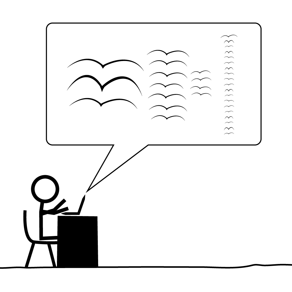
- The second level of encoding takes us from data to structured information
- Giving shape to the data so patterns become visible
Knowledge
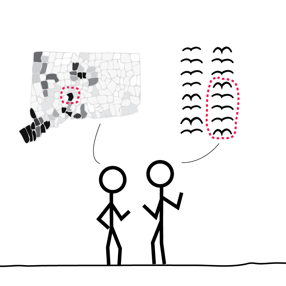
- Information consumption can lead to higher knowledge on the part of the audience
- (if they can perceive the patterns or meaning of data)
Wisdom
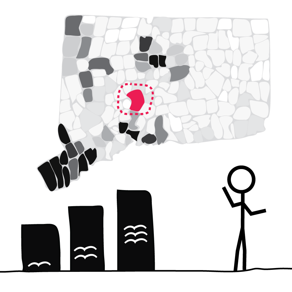
- when we achieve a deep understanding of acquired knowledge
So every step along this path implies higher order
"Minds are highly evolved ways of structuring the bits of information that form reality. That is what we mean when we say a mind understands; it generates order."
The mark of a civilized human is the ability to look at a column of numbers, and weep.
- Bertrand Russell
Keep in mind
Like when you're telling your stories, you've made a list of all the data points you want to express
- It should present several variables
- It should allow comparisons
- It should be organized logically. Chronologicaly or from high to low or low to high.
Let's look at some Hamilton data viz
- It should present several variables
- It should allow comparisons
- It should be organized logically. Chronologicaly or from high to low or low to high.
Don't get carried away
Consider the form and function of the data visualization
Design architectures should be decided on how the architecture assists analytical thinking about evidence


No matter how clever the choice of the information, and no matter how technologically impressive the encoding, a visualization fails if the decoding fails. Some display methods lead to efficient, accurate decoding, and others lead to inefficient, inaccurate decoding. It is only through scientific study of visual perception that informed judgments can be made about display methods.
- William S. Cleveland, The Elements of Graphic Data
Essentially all charts in the end can just be bar charts
But then it would be all so boring
Visualization
Any kind of visual representation designed to enable communication, analysis, discovery, and exploration
Chart
A display in which data are encoded with symbols that have different shapes, colors, or proportions
Chart
Bar chart

Chart
Lollipop chart

Chart
Dot chart
Chart
Scatter plot

Chart
Time series chart

Chart
Slope chart

Map
A depiction of geographical area or representation of data that pertains to that area
Map
Choropleth

Map
Dot map
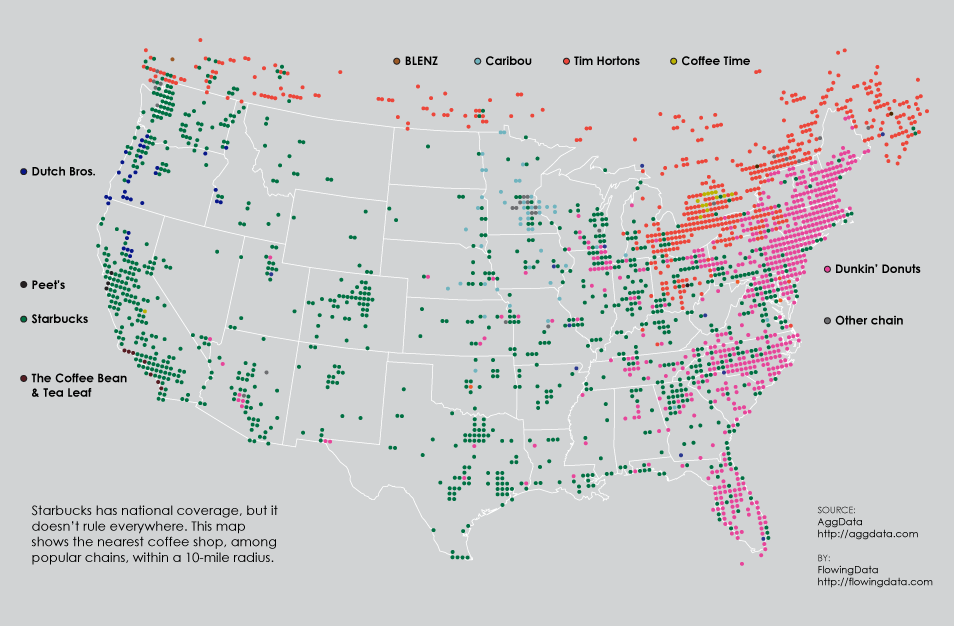
Map
Proportional symbol map

Map
Isarithmic map
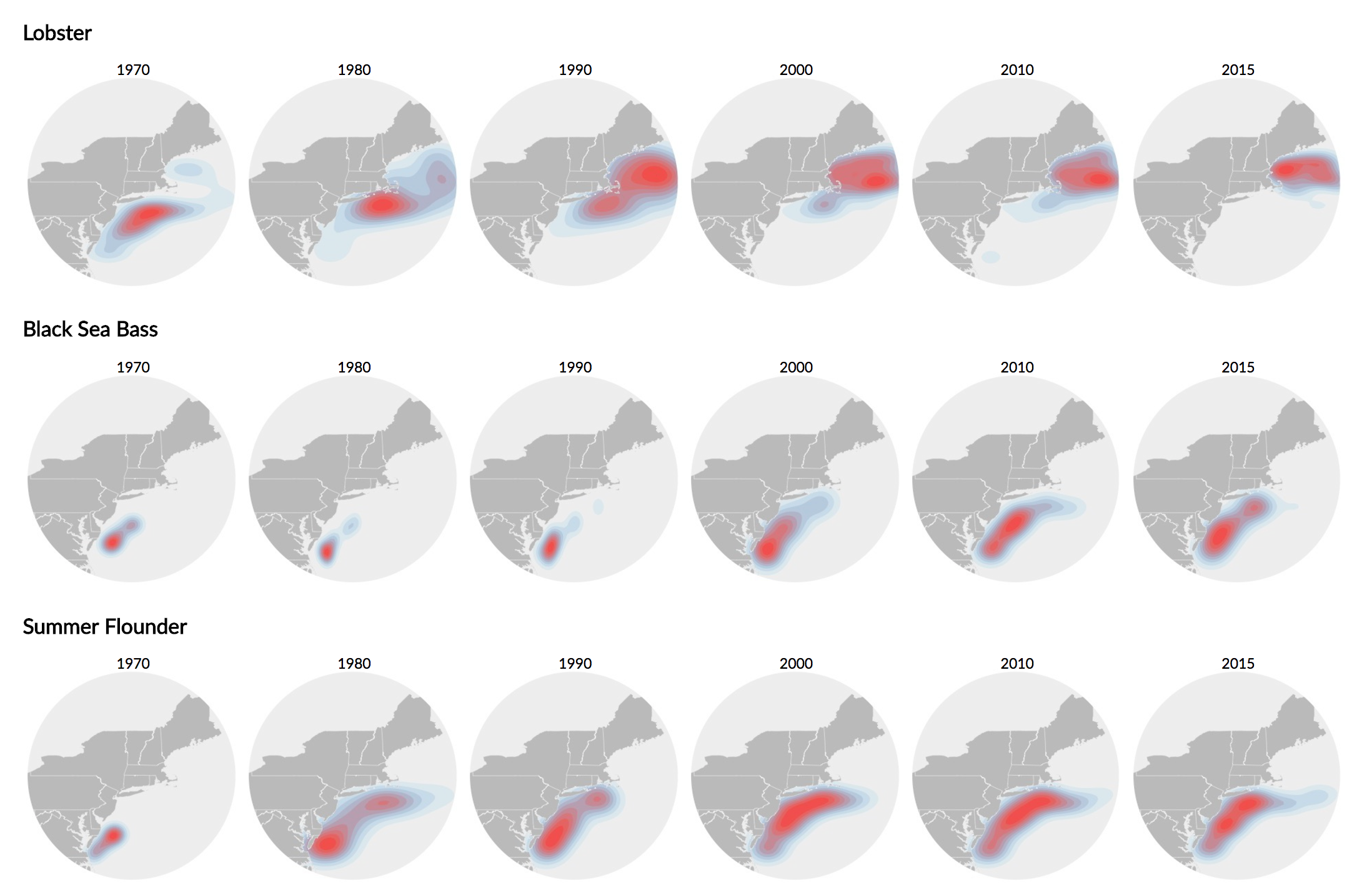
Infographic
Multi-section visual representation of information intended to communicate one more more specific messages
Infographic
Multi-step

Data visualization
Display of data designed to enable analysis, exploration, and discovery
Data visualization
Tools that let people extract their own conclusions from the data
News Application
Special kind of visualization that lets people relate the data being presented to their own lives
News Application
A simulation or a calculator
Five Qualities of Great Visualizations
The greatest value of a picture is when it forces us to notice what we never expected to see.
-John W. Tukey, Exploratory Data Analysis
Five Qualities of Great Visualizations
1. It is truthful
Based on thorough and honest research
Five Qualities of Great Visualizations
2. It is functional
Constitutes an accurate depiction of data, and it's built in a way that lets people do meaningful operations based on it
Five Qualities of Great Visualizations
3. It is beautiful
It's attractive and aesthetically pleasing for its intended audience
Five Qualities of Great Visualizations
4. It is insightful
Reveals evidence that we would have a hard time seeing otherwise
Five Qualities of Great Visualizations
5. It is enlightening
If we grasp and accept the evidence it depicts, it will change our minds for the better

